
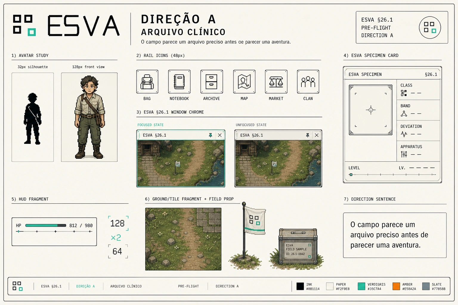
Today I chose what ESVA will look like. Not "approved a mockup" — I chose between three entire visual languages, and the choice governs the ~232 images coming next.
Worth telling how this was set up, because the structure matters more than the taste.
Three directions, one set of contents
Each direction is one board, and all three show exactly the same list: the avatar (32px silhouette and 128px front view), six rail icons, a window with full chrome, a specimen card, a HUD fragment with numbers, a patch of ground with a field object, and a sentence declaring the reading.
That part isn't a detail — it's what makes the three comparable. If each board showed different things, I'd be choosing in the dark: I'd like the avatar from one, the icon from another, and I couldn't tell you which visual language I was picking. Same contents, three interpretations. Then the difference is the direction, and only that.
What was NOT a variable
The brand. Across all three boards, identical and not up for discussion: the palette (Ink #0B1114 · Paper #F2F0E8 · Verdigris #35C7A4 · Amber #E58A2A · Slate #77858B), the typography (IBM Plex Sans for interface, JetBrains Mono for numbers), the logo, the top-down 3/4 projection, the 128px height, and the 24-pose ruler.
That matters more than it sounds. "Three different directions" read literally would have produced three brands — and two of them would be dead on arrival, because they'd violate the manual I closed myself. I'd have been choosing between one option and calling it a decision.
What could vary was something else: pixel weight, interface density, how much bureaucrat versus how much field expeditionary in the character, institutional temperature, window treatment.
The three
A — Clinical Archive. Bright background. Line icons in rounded frames, uniform stroke weight. Discreet window. The avatar is a researcher in a khaki shirt with a flask bandolier. *"The field looks like a precise archive before it looks like an adventure."*
B — Field Notebook. Olive, more closed. The window arrives with its fields filled in — subject, location, coordinate, UT time. There's a surveyor's tripod in the corner. The avatar carries more gear and the uniform hardens. Its sentence read: *"The institution follows the initiate into the field without becoming a military uniform."*
C — Post in Use. The darkest and the densest. Heavy parka. The interface has a sidebar with six sections and a sync indicator at 97%. Tent, crates. *"The archive already lives in the field: rugged, worn and immediately operational."*
Why A
Because it's the only one that meets a requirement I wrote months ago and nearly forgot.
It's in §26 of the design document, logged as a requirement of the menu redesign: "get out of the heavy black inside the game — the site's black is good — and everything else cleaner." I wrote that, marked it pending, and the pending item sat there long enough that I didn't remember it when I looked at the three boards.
B and C are dark. They're beautiful and they're coherent, but both do exactly what §26 told me to stop doing. A is the only one on a Paper background, and the only one where the interface breathes.
There's a second reason, and that one is about the genre. ESVA is an idle: the game keeps running behind the windows. Direction C is the densest of the three — a sidebar with six items, a sync meter, stacked panels. Density is the most expensive thing there is in an idle, because every pixel of interface is a pixel where you don't see the world. C is gorgeous standing still. In motion, it covers the game.
And then there's B, the most interesting case of the three: its own sentence admits its own risk. *"Without becoming a military uniform"* is a defensive line — it exists because whoever drew it noticed they were getting close to the edge. And they were. The Order measures, contains and publishes; it doesn't invade. A player who looks at B for three seconds sees a technical militia. That isn't what the game is.
The detail I liked most
In A, the focused window has a Verdigris border and the unfocused one has a grey border — but the difference isn't only the colour. The frame changes weight, and the title changes treatment.
That's a closed rule here: no state is communicated by colour alone. It's for colourblindness, and it's for the principle that information needs shape. Seeing that principle applied without anyone asking, in a window-chrome detail almost nobody would look at, was the strongest signal that the direction had understood the game — stronger than the avatar, which is the part that jumps at you.
What it costs me
A bright background is harder. Pixel sprites on Paper lose the free outline that a dark background hands you — every silhouette will have to hold up on its own, without black helping. Flaws will show that direction C would have hidden.
Accepted. It's consistent with the rule that governs the whole project: presence communicates; absence doesn't. A game that needs the dark for things to look good is using the absence of light as a crutch.
What's still open
I haven't decided how the windows behave on phones. They're draggable and overlapping on desktop — that's settled — but a draggable window doesn't fit a phone screen, and the minimum touch target is 44 pixels. The ways out are stacked full screens, bottom sheets, or dragging only on tablets. None was chosen, and that's why touch adaptation is on hold. It's logged as pending, not as forgotten.
The other two boards were filed. Not because I'll walk this back — but because six months from now, when someone asks why ESVA is bright, the answer won't be "just because." It'll be: here are the three, here's each one's sentence, and here's the §26 paragraph that decided it.